Even iconic brands
need a new look
HARRAWAYS REBRANDS ‘CONVERSION POINT’ IN STYLE
For over 150 years,
generations of Kiwi’s have
enjoyed their favourite
Harraways oats for breakfast
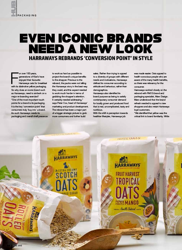
with its distinctive yellow packaging.
So why does an iconic brand such
as Harraways, need to embark on a
major re-branding exercise?
“One of the most important touch
points for a brand is its packaging.
It is the key ‘conversion point’ that
consumers truly ‘buy into’ a brand.
As such Harraways needs its
packaging and overall shelf presence
to work as hard as possible to
project the brand’s unique benefits
to the shopper. Previous to the
rebrand, the packs were not telling
the Harraways story in the best way
they could, and this aspect needed
to work much harder in terms of
grabbing the shopper’s attention.
It certainly needed addressing,”
says Peter Cox, head of Harraways’
marketing and product development.
The rebrand has been a major part
of a bigger strategic picture to grab
more consumers and further build
sales. Rather than trying to appeal
to a diversity of groups with different
needs and motivations, Harraways
defined its consumer according to
attitude and behaviour, rather than
demographics.
Harraways also identified its
brand purpose as being to satisfy
contemporary consumer demand
for locally grown and produced food
that is real, uncomplicated, tasty and
nutritious.
With the shift in perception towards
healthier lifestyles, Harraways job
was made easier. Oats appeal to
health-conscious people who are
aware of the many health benefits,
so there was relevancy for the
consumer.
Harraways worked closely on the
rebrand with FMCG brand and
packaging specialist, Marx Design.
Marx understood that the brand
refresh needed to appeal to new
shoppers and also retain Harraways
loyal customers.
“We identified that yellow was the
critical link to brand familiarity. While
PA C K A G I N G
34 JUNE 2019